Michigan Medicine: Von Voigtlander Women's Hospital Internal Platform
A redesign of the internal SharePoint platform used daily by Von Voigtlander Women's Hospital's clerical staff, focused on fixing broken navigation and information hierarchy so staff can find critical information quickly, consistently, and reliably.

Context
The 36-person clerical staff team at Michigan's Women's Hospital are the backbone of the Birth Center and OB/GYN Clinic. Every day, they check patients in and out, schedule appointments, manage records, order supplies, and even carry out hospital-wide emergency protocols when needed. All of this through one platform.
With that much responsibility and so little time to find the right information, how well that platform is organized has a major impact on hospital workflow and patient care.

How might we… help clerical staff find critical information faster and more reliably?
Contextual Inquiry
I visited the hospital weekly for three months, interviewing staff and observing their normal routines at work. Hearing their pains and needs straight from the source helped me spot the patterns and problems that kept repeating. Watching a typical workday also showed me how those issues came up, and why. I was lucky that all 36 staff members were willing to take part and share their experience.
Key Findings
- Finding forms and protocol documents
- Looking up contact information
- Following step-by-step instructions, from routine paperwork to emergency response
- Too many tabs to click through
- Information buried in formats that were hard to scan
- No clear path to what they needed, especially under time pressure
The takeaway was simple: it was a hierarchy and navigation problem.
Constraints
Von Voigtlander was set on keeping the redesign on SharePoint, which came with a few limits: I could view the original site but never edit it, and with no previous documentation, I had to rebuild the structure by hand. The platform also ruled out certain design choices my research pointed to, like a vertical navbar. Since my goal was simplifying navigation, not visual aesthetics, the design trade-offs were ones I could live with.
Design Decisions
I developed a new design built around three key choices.
Clearer Navigation Labels
I renamed and reorganized the navbar sections so staff could tell tabs apart at a glance, no more guessing which page held which information.

Widget-Based Layout
I replaced long pages of bullet points with widgets that visually separate information into distinct sections, making it easier to scan at a glance.

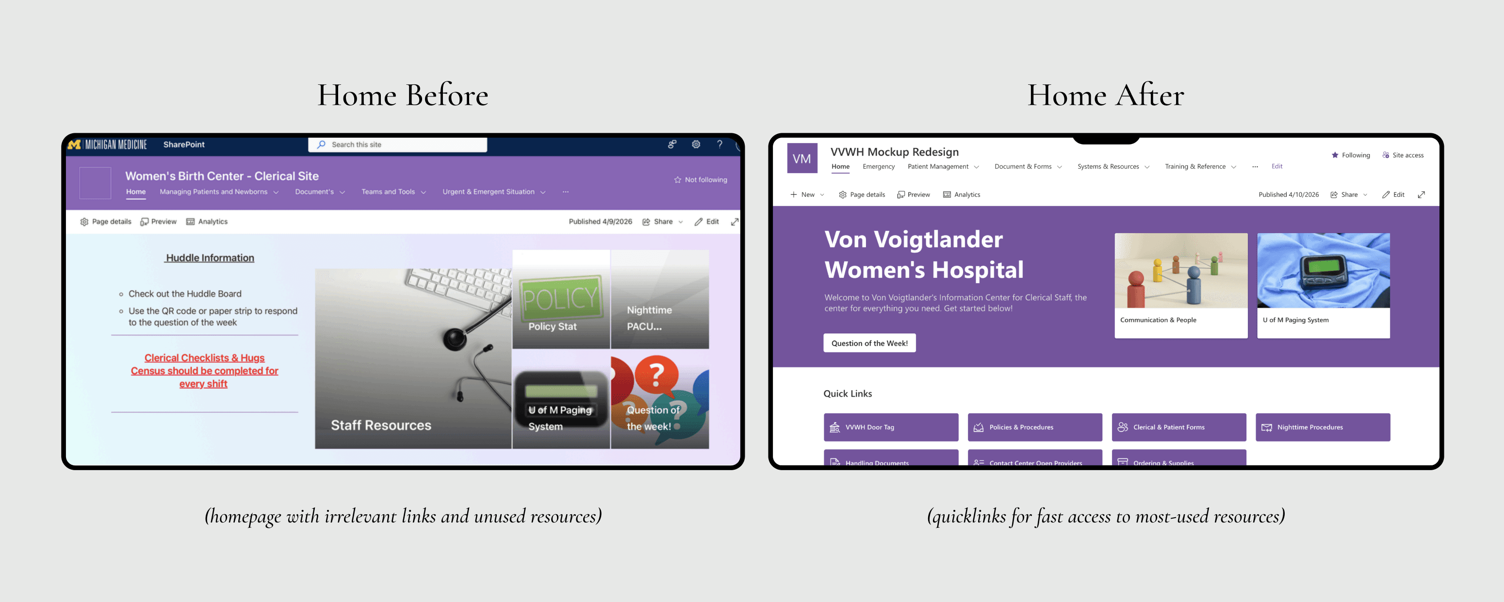
Homepage Quick Links
I added a quick-links section to the homepage featuring the seven most commonly used resources, so staff can jump straight to what they need most.
Outcome & Reflection
I tested it with the full staff and the Administrative Director. Every single person preferred the new design over the old, with average usability ratings jumping from 4.3 to 6.5 on a 1-7 scale. The site was implemented and is now being used by staff. I made sure to set up documentation for a smooth transition, so they could implement my design on their own.

Learnings
This project taught me how to communicate about design with non-designers, how to translate shared pains and feedback into what people actually need, how to test prototypes and measure task success, and how to document a project for handoff. The aesthetics were constrained by SharePoint's capabilities, but I'm proud to have learned a new platform and found workarounds to make Von Voigtlander's internal site quick, consistent, and reliable.